Black And White All Over
Black And White All Over
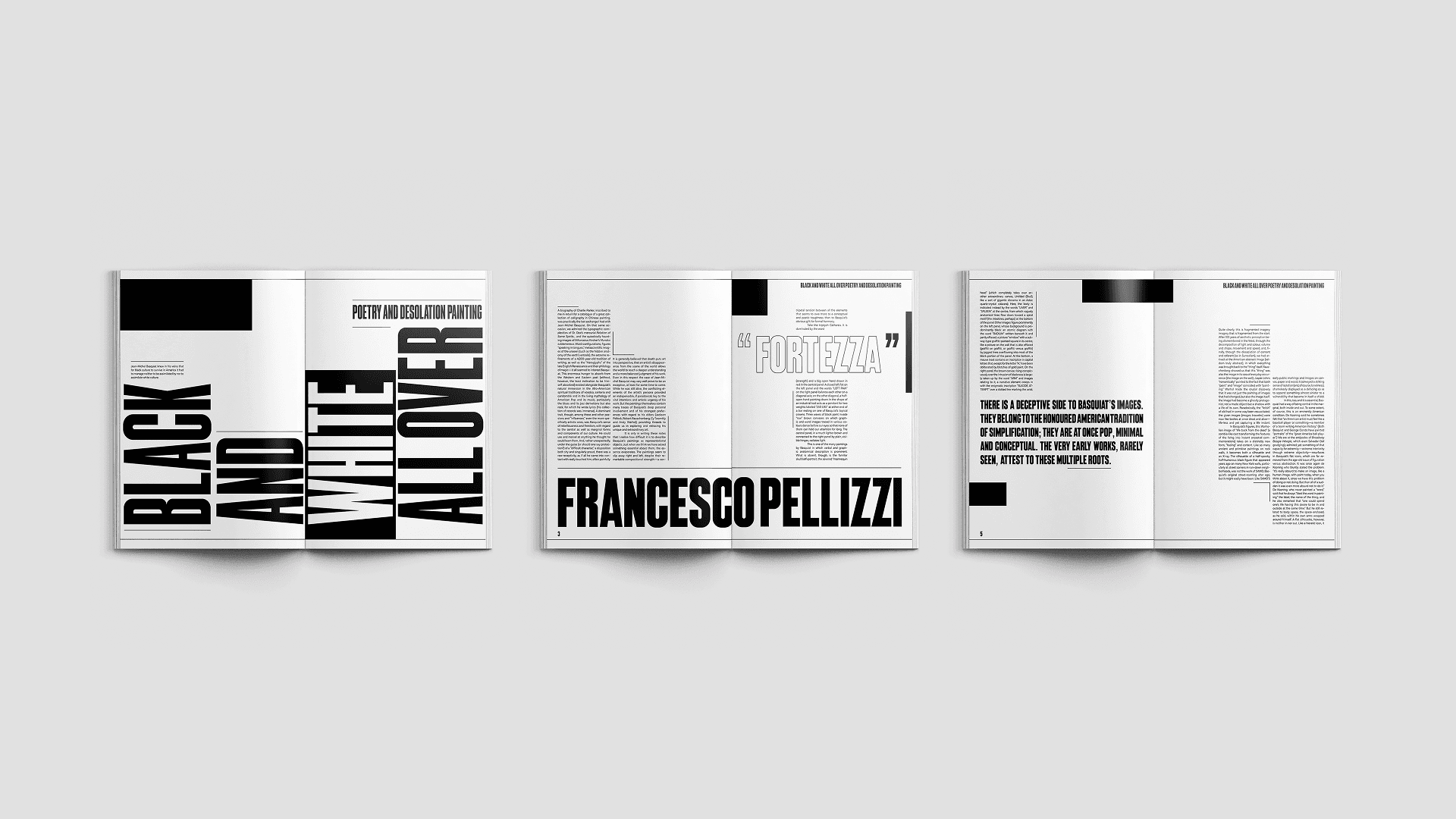
Black and White All Over: Poetry and Desolation Painting is presented through a bold, contrast-driven typographic design. The opening spread uses stark black and white fields to echo the essay’s title and urban tone. Across the spreads, titles and body text are arranged to resemble city buildings, creating an architectural layout inspired by graffiti and street art.
Year
2024
Category
EDITORIAL DESIGN
Research
Research
For research, I closely examined the essay’s language and themes, translating its focus on urban space into visual form. The structure of the titles and body text was designed to resemble city buildings, using typography to reflect the architectural environment of graffiti and street art.
For research, I closely examined the essay’s language and themes, translating its focus on urban space into visual form. The structure of the titles and body text was designed to resemble city buildings, using typography to reflect the architectural environment of graffiti and street art.
Research
For research, I closely examined the essay’s language and themes, translating its focus on urban space into visual form. The structure of the titles and body text was designed to resemble city buildings, using typography to reflect the architectural environment of graffiti and street art.
Design
Design
The design prioritizes clarity and visual rhythm, balancing dense text with open space to guide the reader through each spread. Scale, alignment, and hierarchy are used to create movement across the page, allowing the layout to feel grounded while still dynamic at the same time.
The design prioritizes clarity and visual rhythm, balancing dense text with open space to guide the reader through each spread. Scale, alignment, and hierarchy are used to create movement across the page, allowing the layout to feel grounded while still dynamic at the same time.
Design
The design prioritizes clarity and visual rhythm, balancing dense text with open space to guide the reader through each spread. Scale, alignment, and hierarchy are used to create movement across the page, allowing the layout to feel grounded while still dynamic at the same time.


ABOUT
ABOUT
Black and White All Over: Poetry and Desolation Painting explores the relationship between poetry, painting, and urban visual culture. The essay examines how artists use contrast, expression, and visual rhythm to communicate meaning, drawing connections between contemporary art and the atmosphere of modern city life.
Black and White All Over: Poetry and Desolation Painting explores the relationship between poetry, painting, and urban visual culture. The essay examines how artists use contrast, expression, and visual rhythm to communicate meaning, drawing connections between contemporary art and the atmosphere of modern city life.
ABOUT
Black and White All Over: Poetry and Desolation Painting explores the relationship between poetry, painting, and urban visual culture. The essay examines how artists use contrast, expression, and visual rhythm to communicate meaning, drawing connections between contemporary art and the atmosphere of modern city life.
CHALLENGE
CHALLENGE
The challenge of this project was to interpret a written essay through editorial design. The spreads translate the ideas of the text into a visual reading experience while maintaining clarity and readability throughout the content.
The challenge of this project was to interpret a written essay through editorial design. The spreads translate the ideas of the text into a visual reading experience while maintaining clarity and readability throughout the content.
CHALLENGE
The challenge of this project was to interpret a written essay through editorial design. The spreads translate the ideas of the text into a visual reading experience while maintaining clarity and readability throughout the content.
More Works More Works
More Works More Works

TORONTO, ONTARIO
GO BACK TO TOP
TORONTO, ONTARIO
GO BACK TO TOP